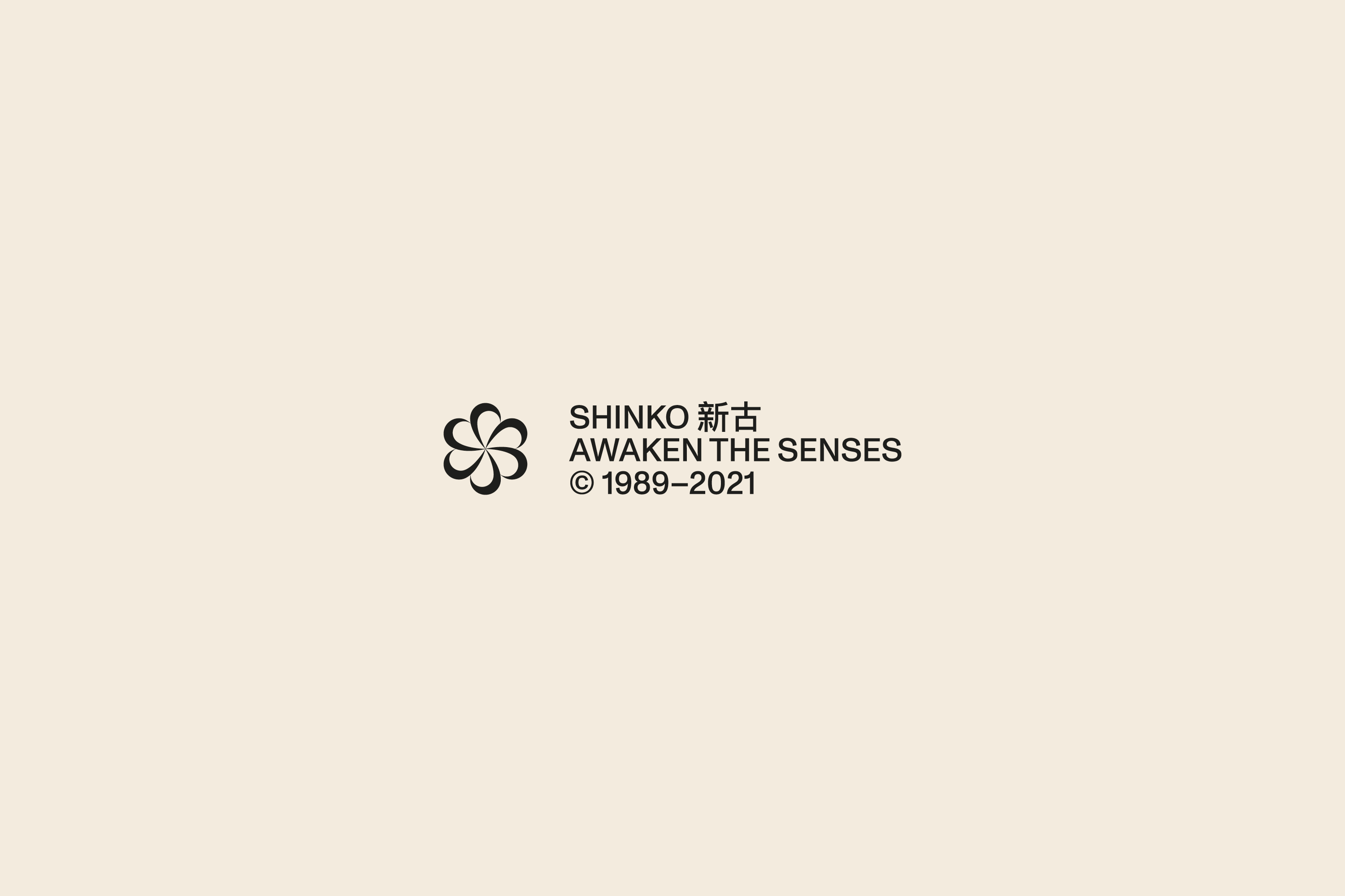


Shinko
2020–2022
Naming
Brand Stratgy
Brand Identity
Art direction
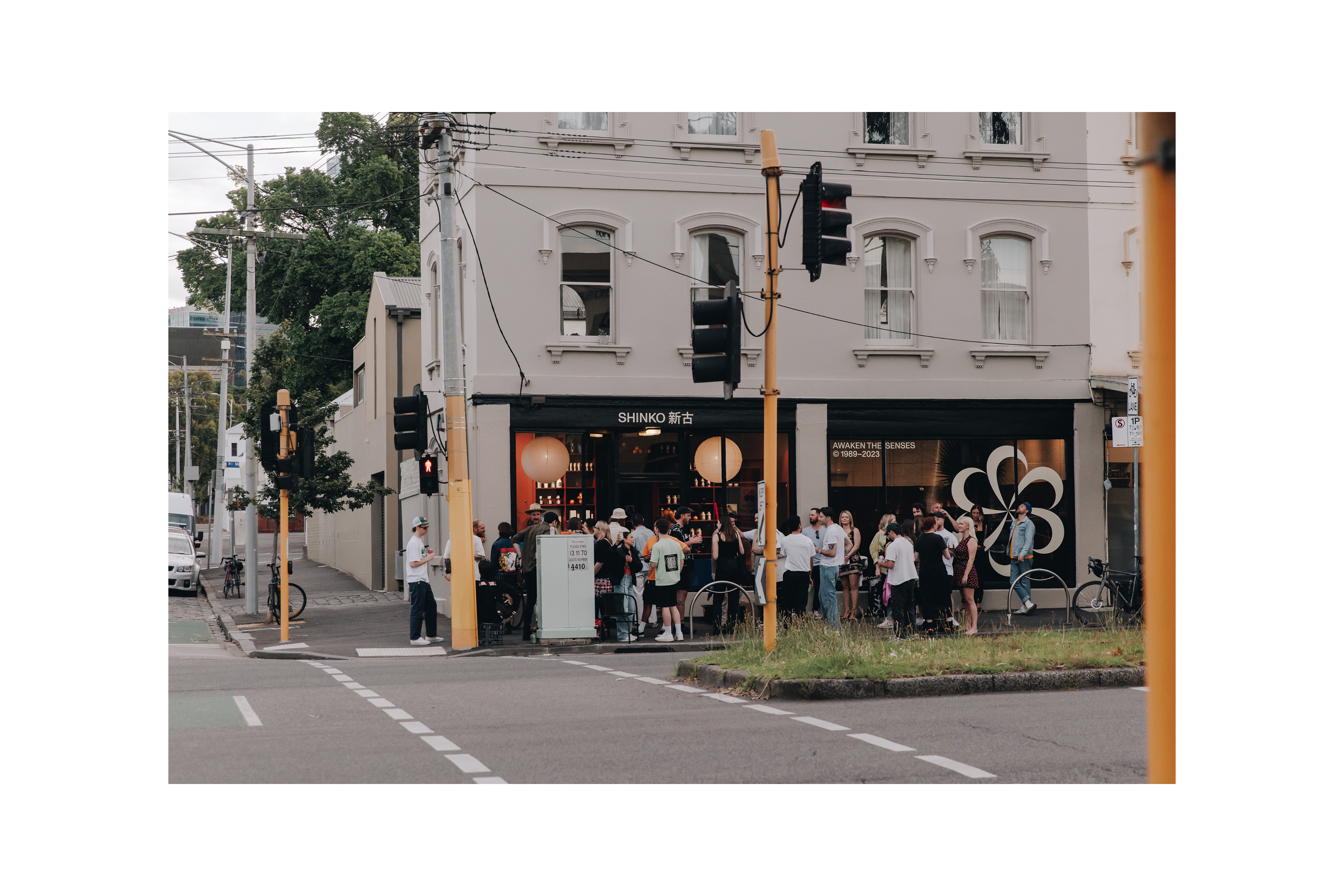
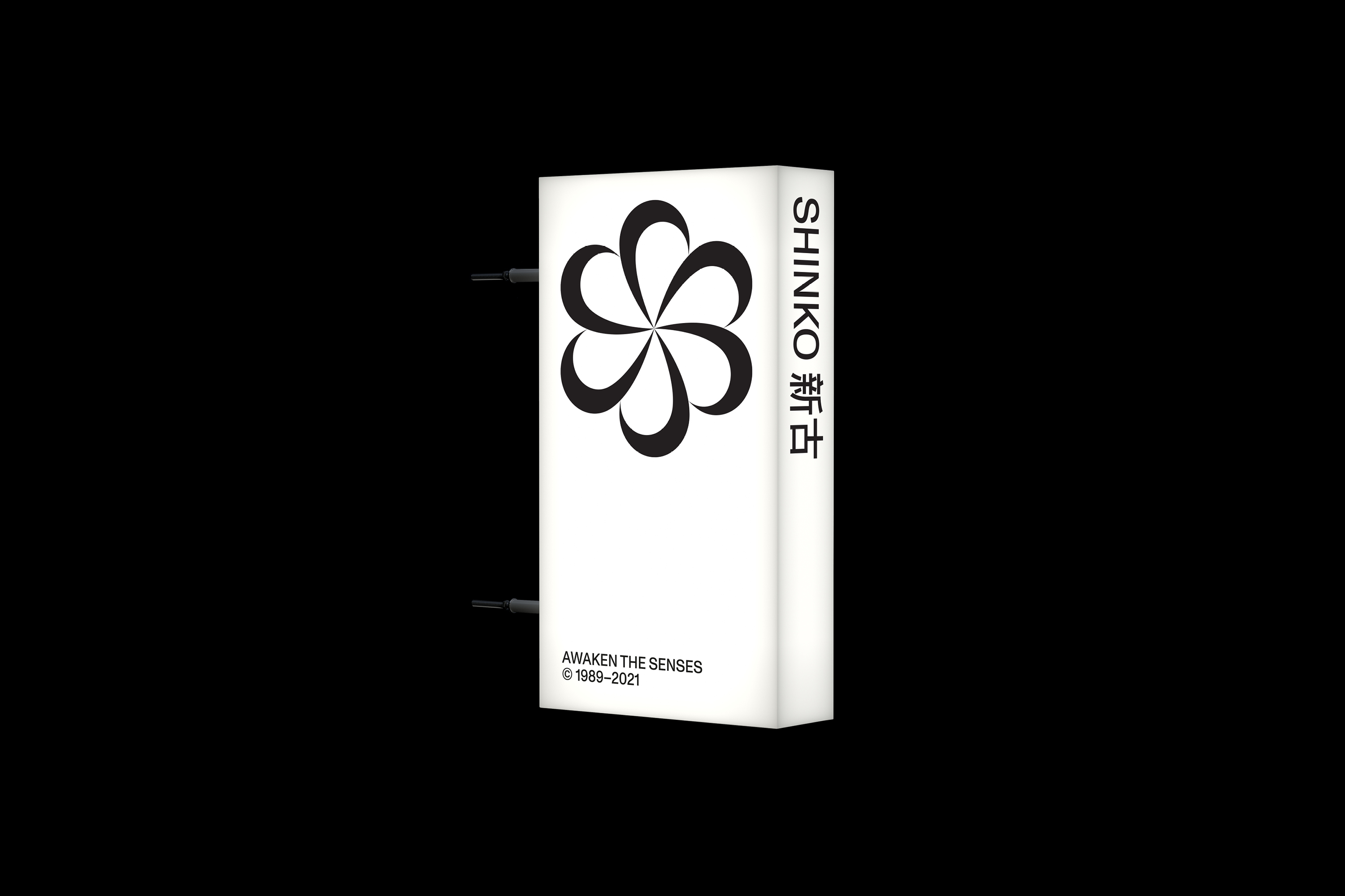
Signage
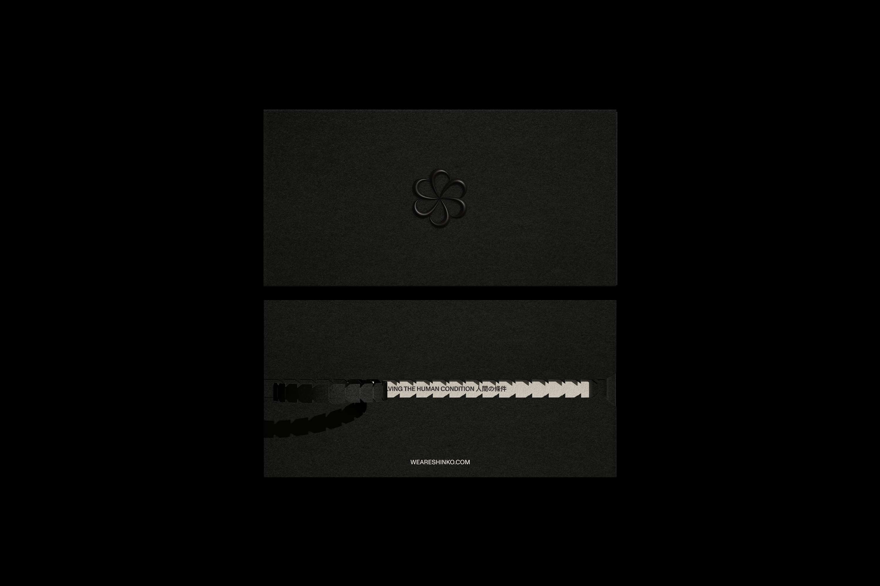
Packaging
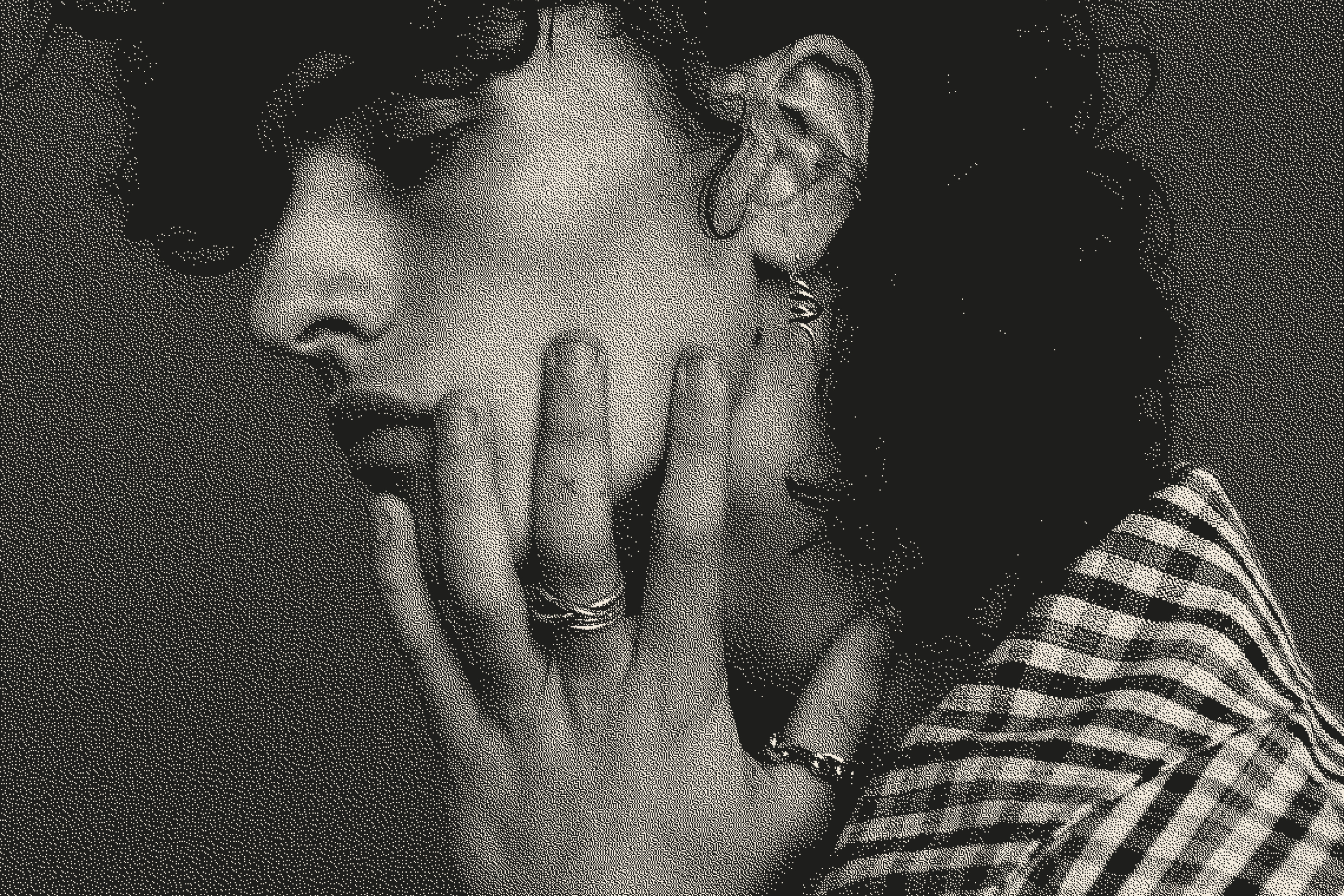
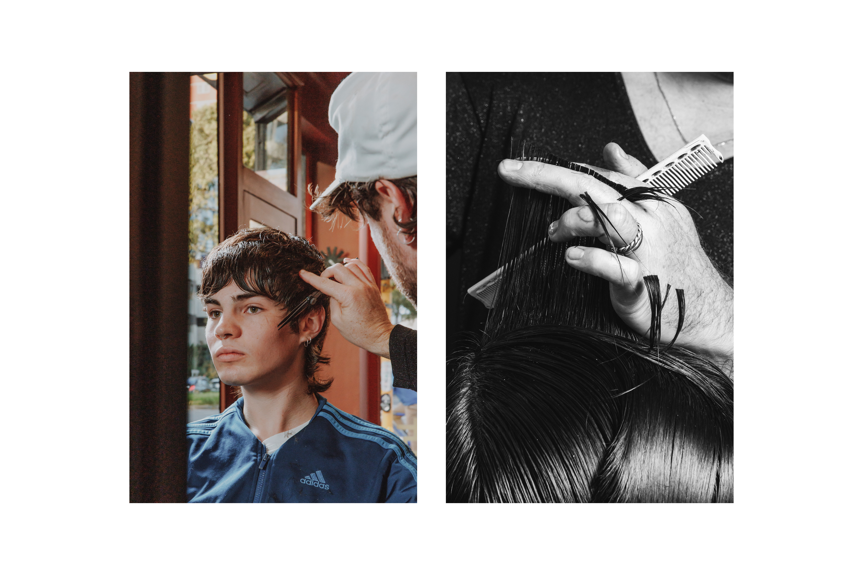
Photography:
Drew Wheeler
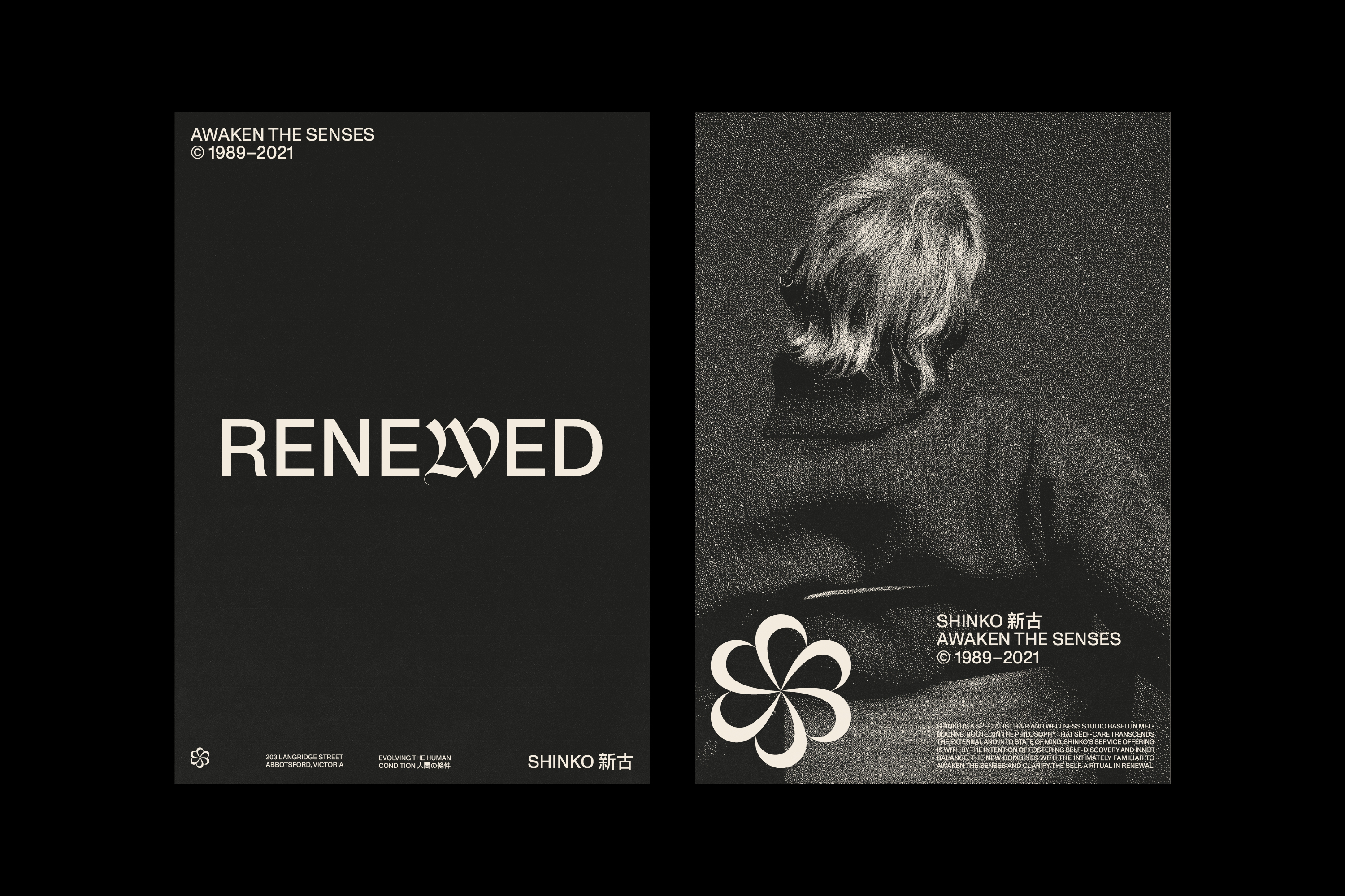
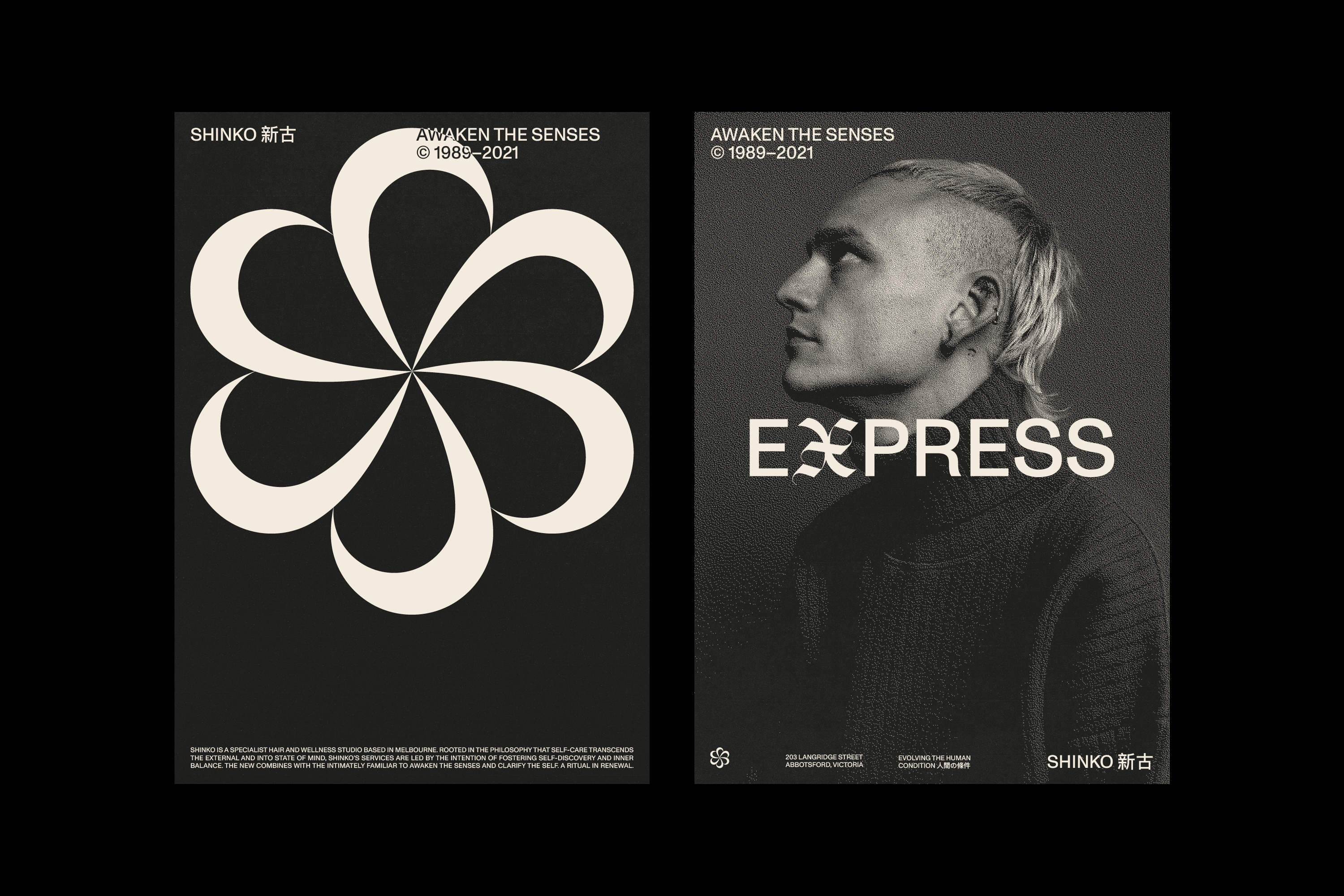
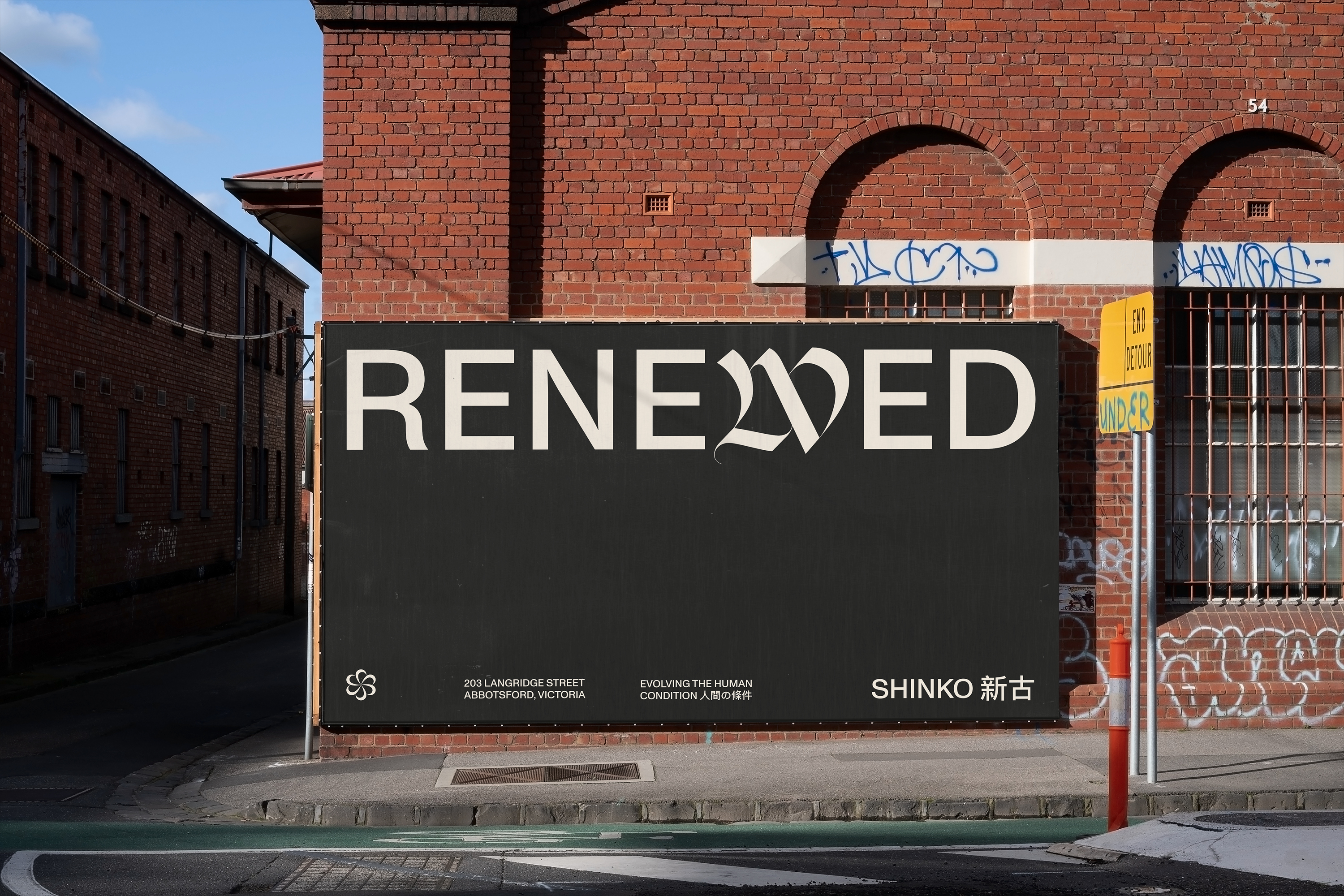
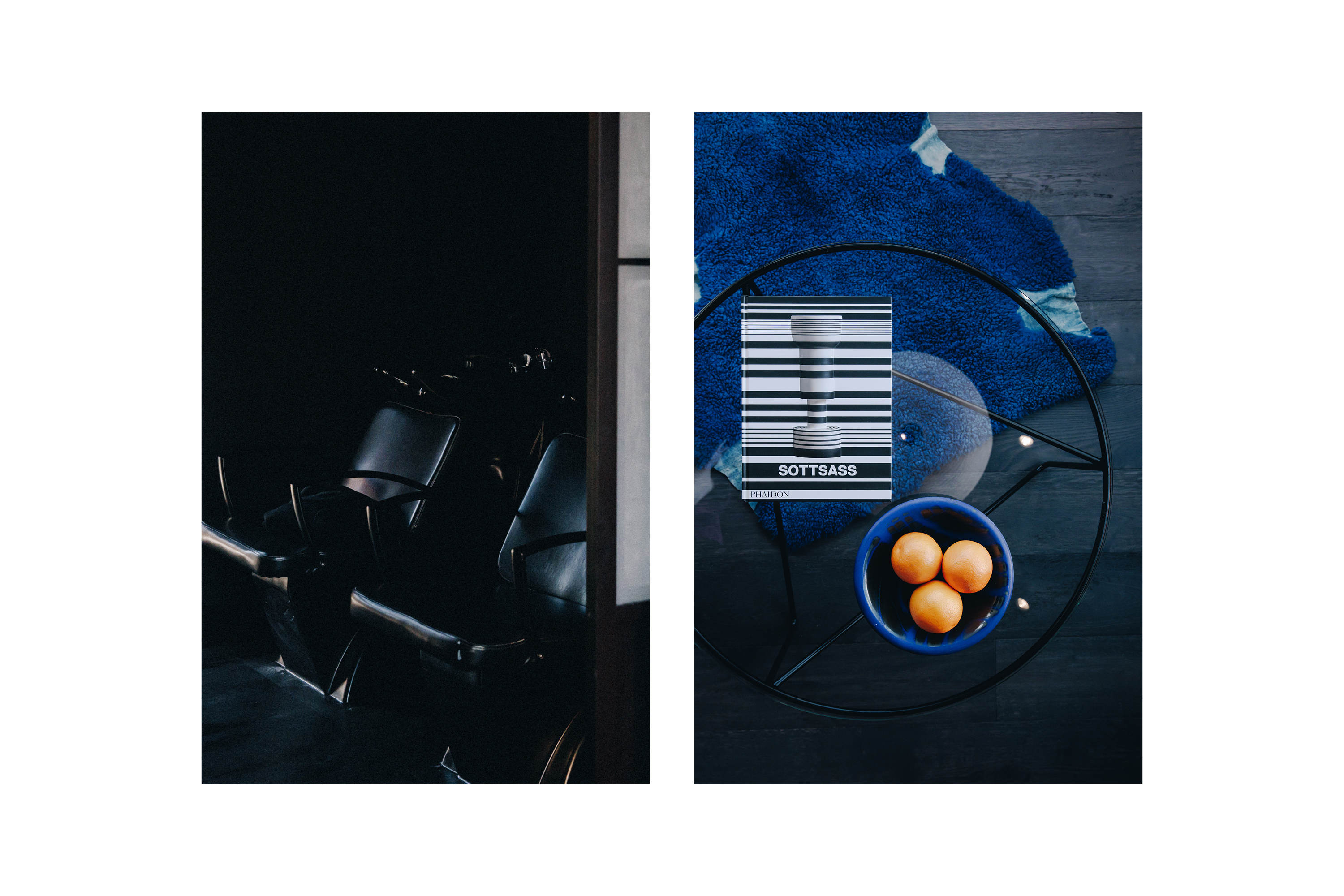
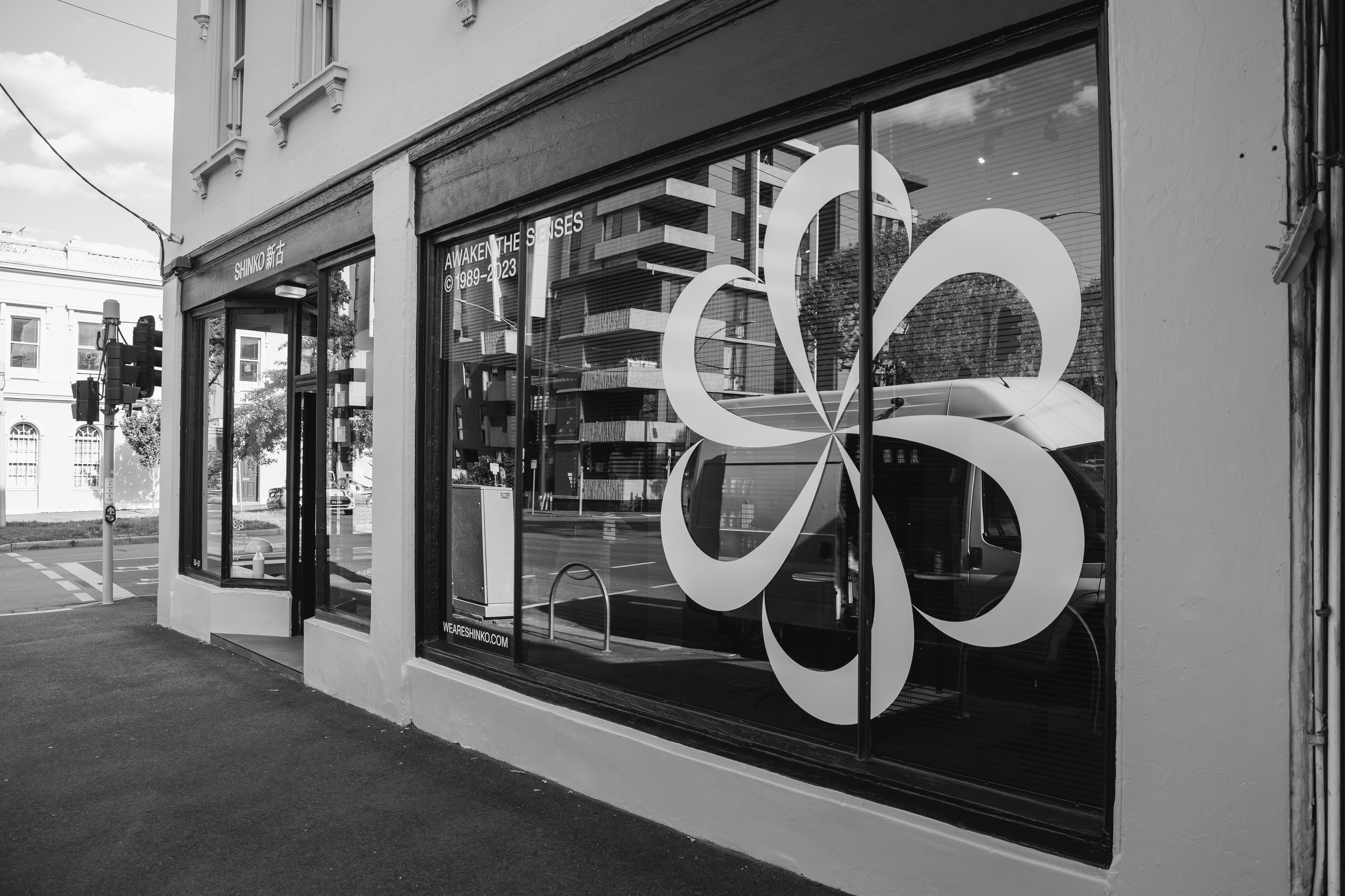
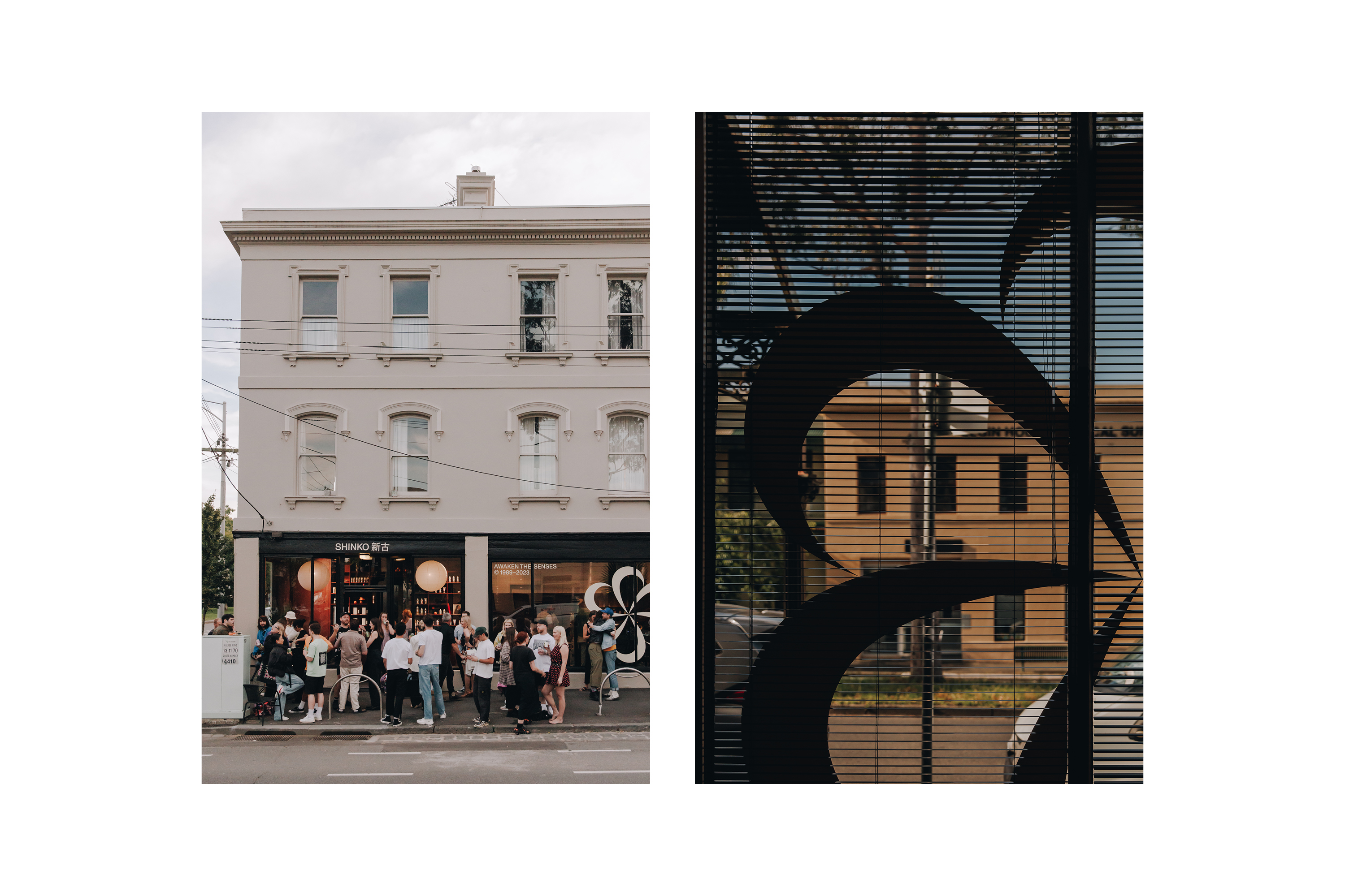
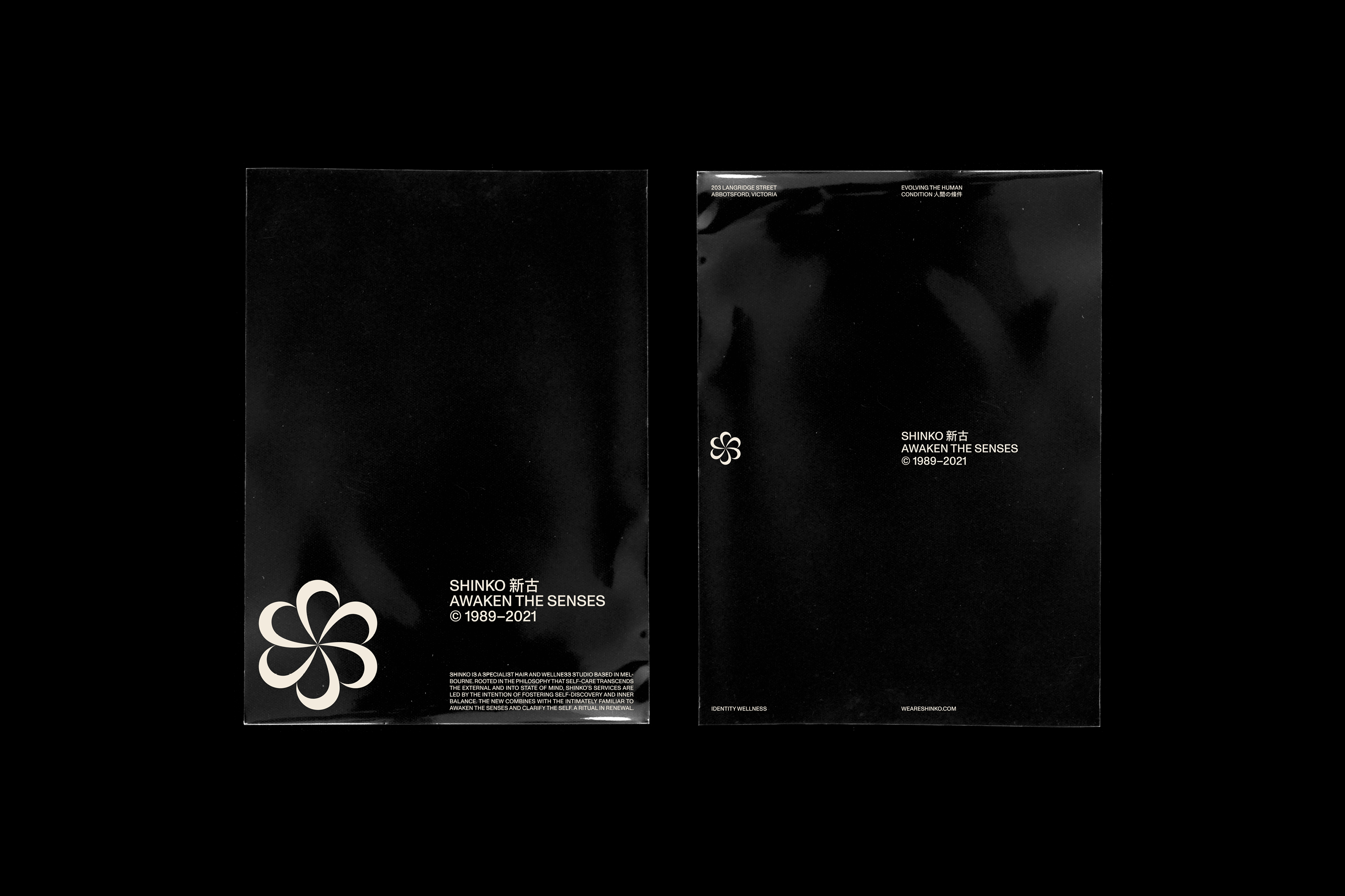
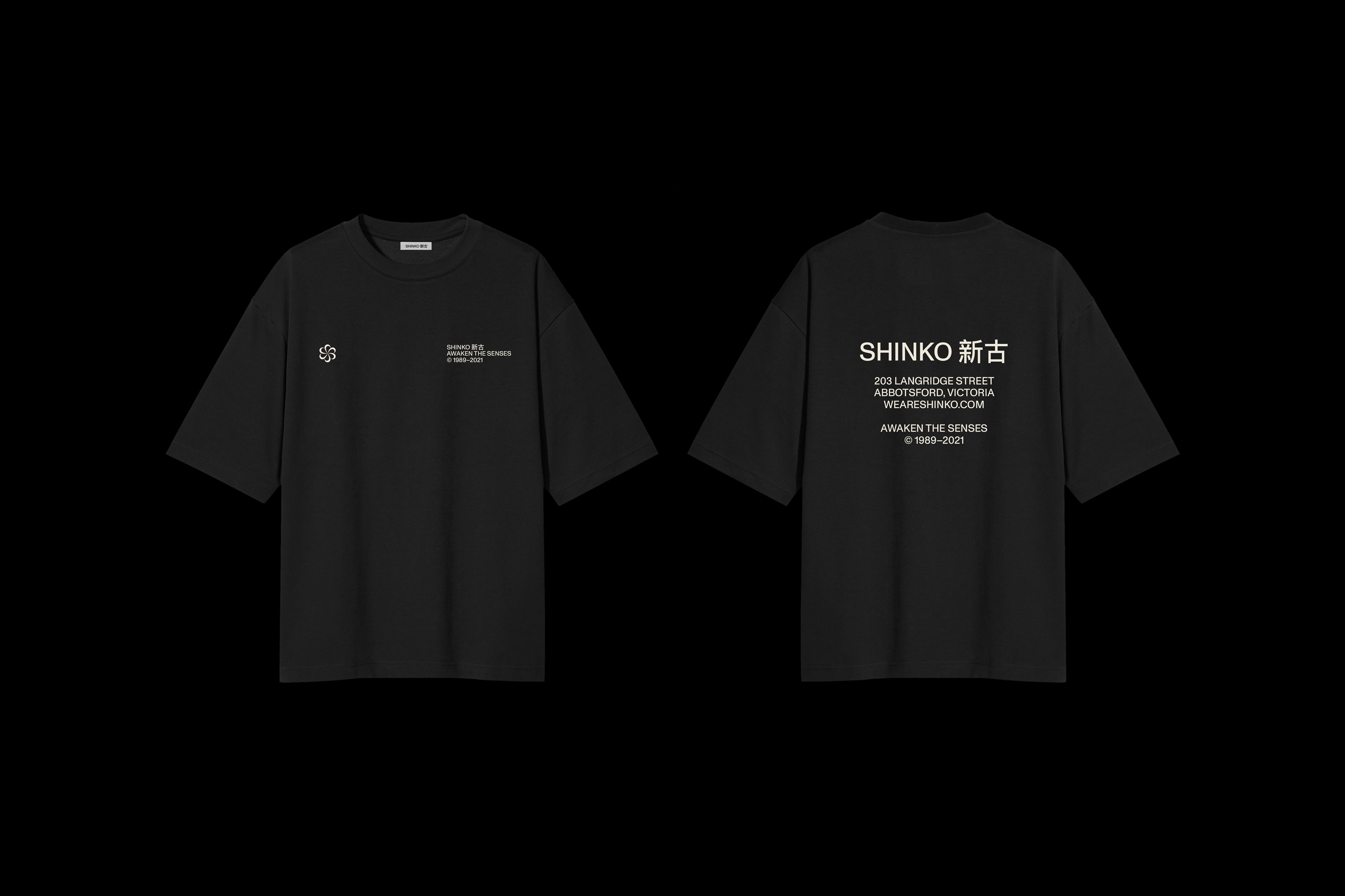
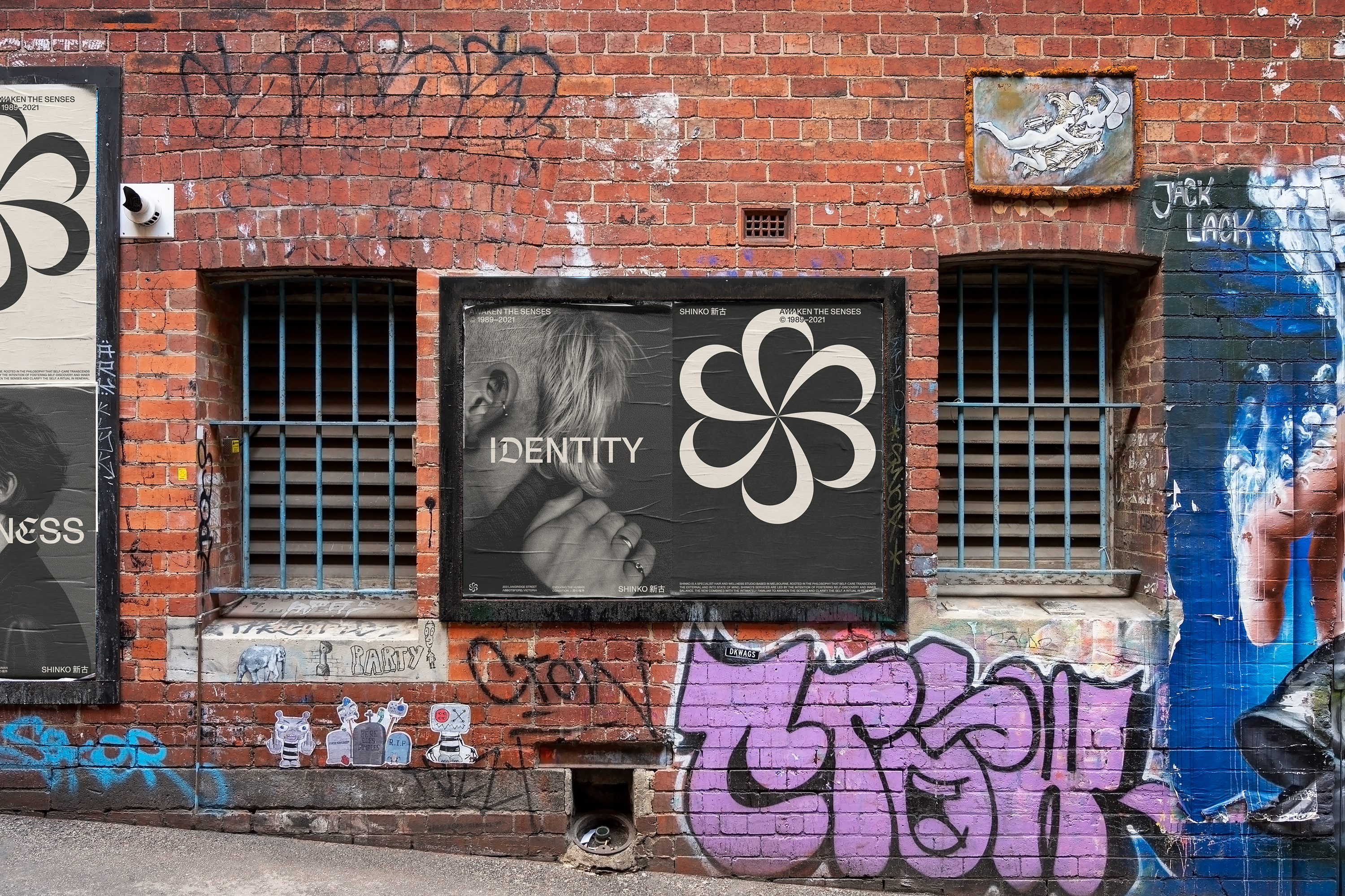
Shinko is a specialist hair and wellness studio based in Melbourne, Australia. Rooted in the belief that self-care extends beyond grooming, the studio offers barbering and wellness treatments designed to centre the mind, clarify the self, and awaken the senses.
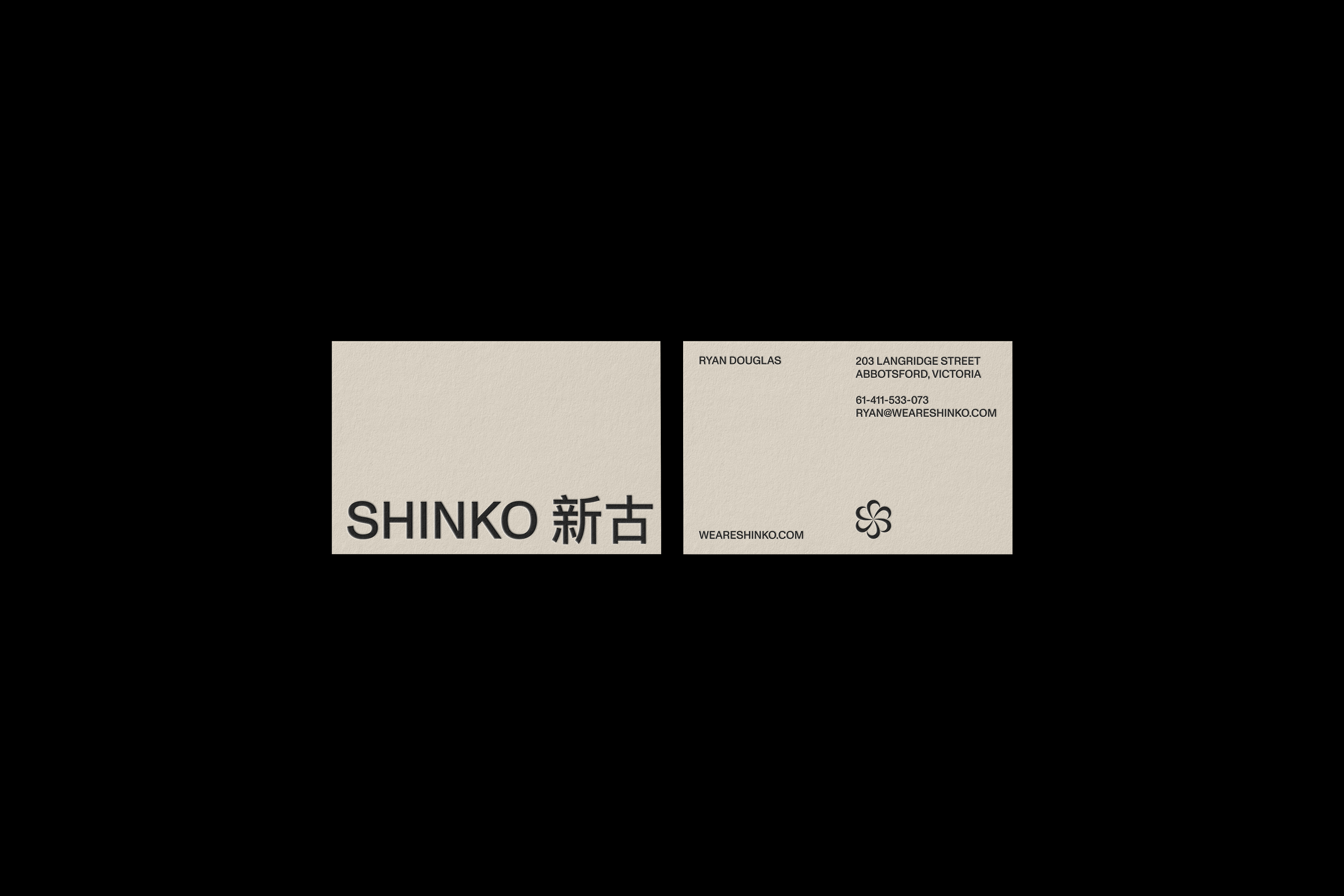
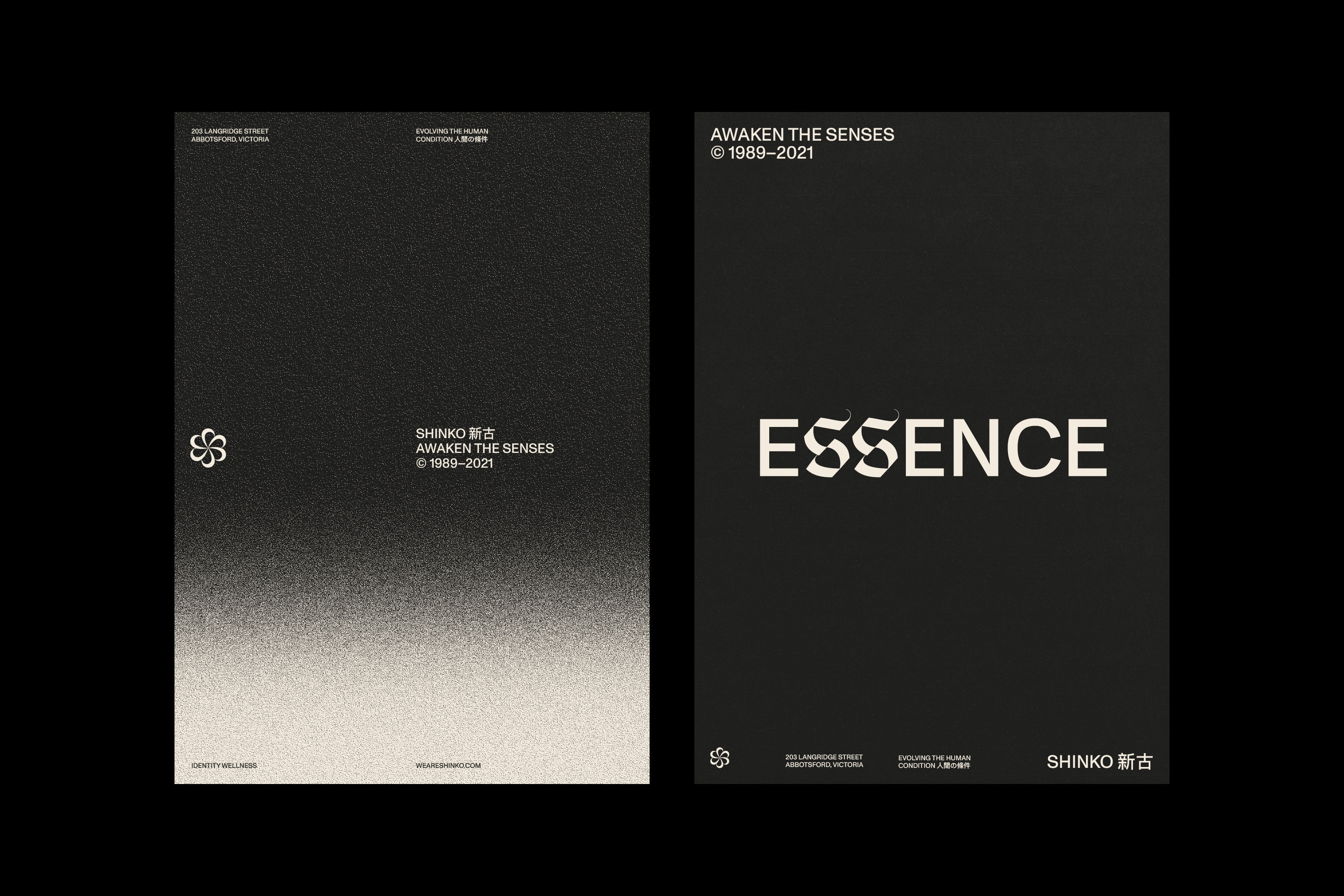
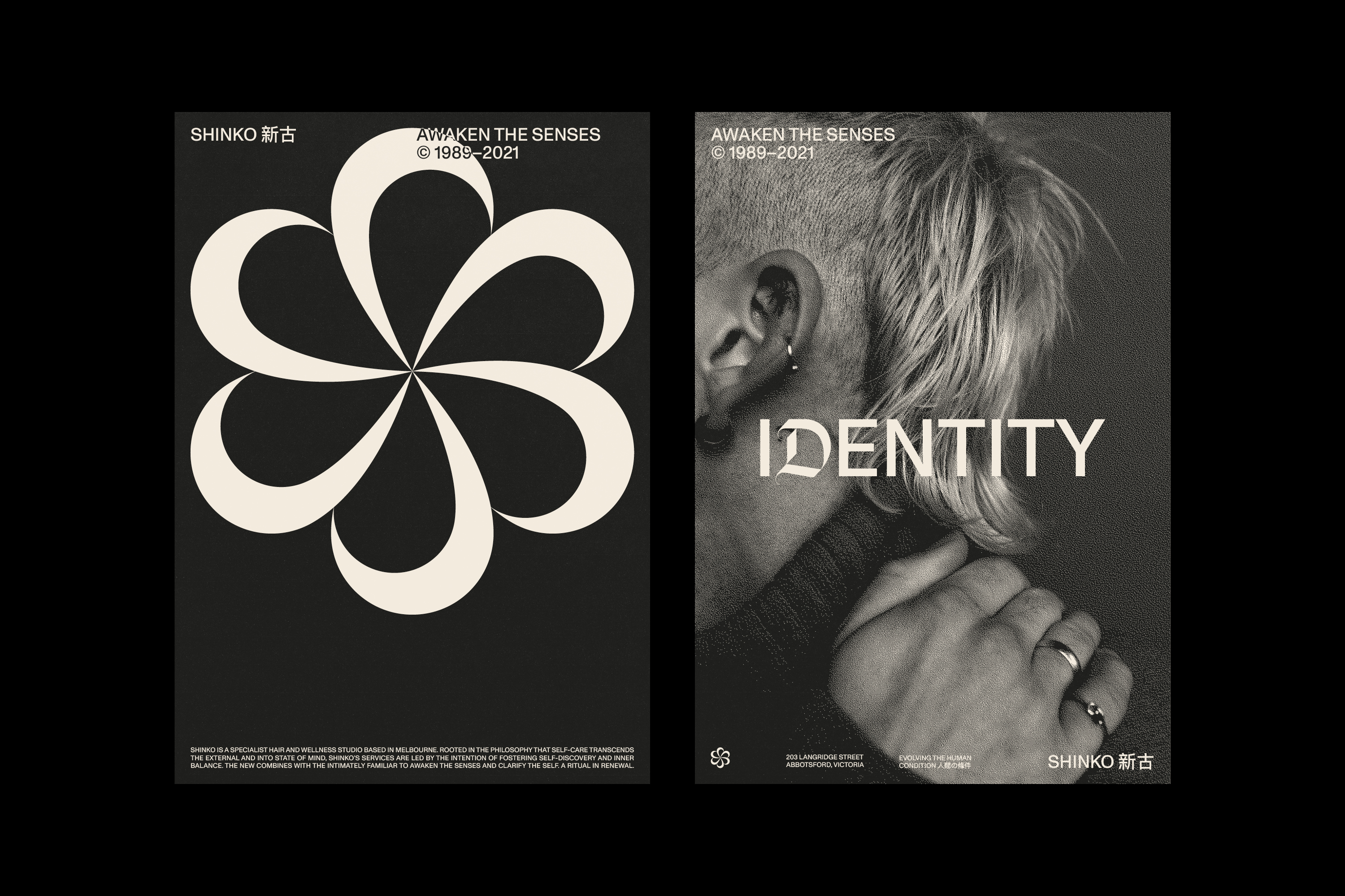
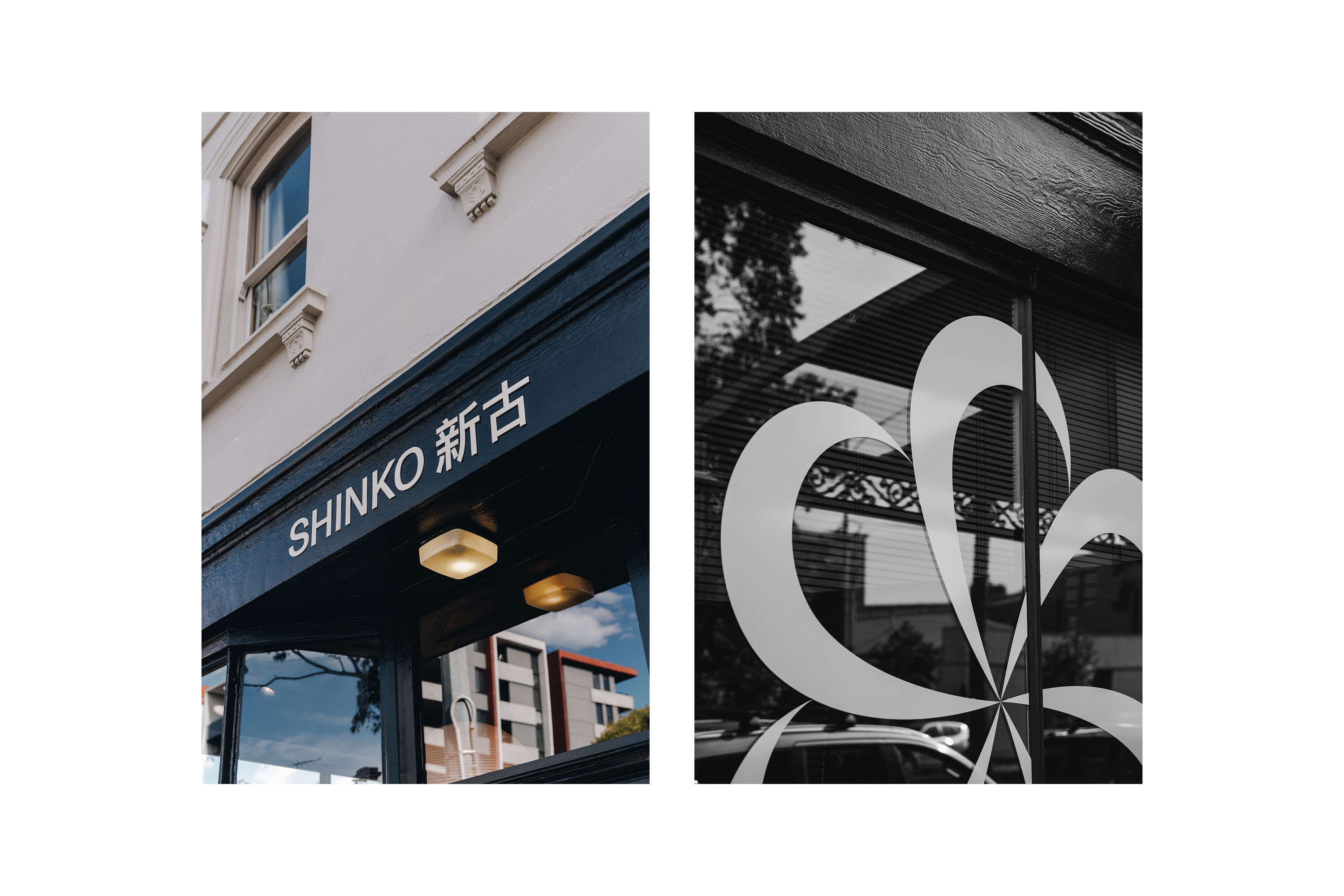
The brand draws its name from the Japanese word Shinko, meaning "new and old"—a duality that sits at the heart of its identity. The visual language balances this interplay: historically inspired letterforms (Emeritus) are paired with the contemporary edge of Monument Grotesk, creating a dialogue between past and present. This contrast is echoed across details—analogue photography rendered with bitmap treatments, the use of both English and Kanji in the logotype—all reinforcing the studio’s cyclical, layered philosophy.
The brandmark takes cues from traditional Japanese kamon (family crests), reinterpreted through a modern lens. It speaks to lineage and ritual, while nodding to the regenerative nature of Shinko’s practice—where grooming becomes a rhythm, and self-care a return.